Thursday, 18 December 2014

Practice Editing

Before starting the editing process we thought it would be a useful task to understand how the editing technology works. Therefore we shot some short clips in order to practice editing techniques we will be using when we start to edit our film.


In our practice editing we tried to use techniques that we would want to use in our music video. Firstly we changed the pace, in order to make it slow motion. In our video we have planned to use this effect to add emphasis.
Secondly we changed the effect of the clip making it into black  and white, whilst in the process we saw the other effects which can be used. We added a fade of the end this will be a key editing concept to grasp, as it will be used a lot through out our video.


Tuesday, 9 December 2014

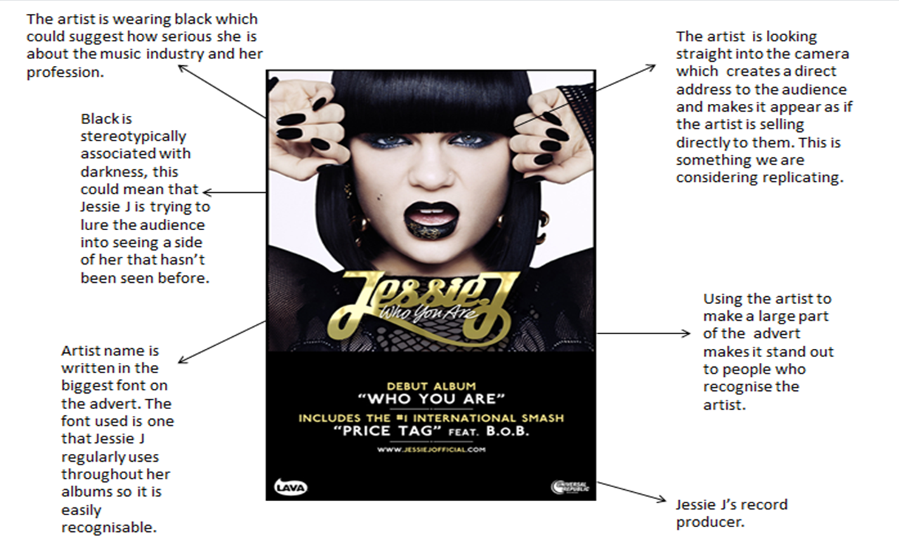
Magazine Albumn Advertisment Analysis


Font Analysis


Chase and Status are the band who's song we have chosen to use. Therefore, by looking at the fonts they use we can gather which font will work the best for us. This font is modern and edgy which helps to represent the genre. The font is bold and in a blocked format with slices in the letters, this is a font in which Chase and Status have used regularly so can easily be associated with them. The black and orange colour scheme is both striking and mysterious and gives the font an edge within the dance music industry.

This font works in a similar way in the fact that it is modern. The paint effect on this works well to show the creative element of music, this however appears to be like street art which does fit with the genre, however, we would like a more professional font.


This font is very affective in the way it looks creative but also proffesional. The font is similar to one used by "Chase and Status" and therefore links to the modernism of the band. A memoralable font is key because it allows an audience to remember the band easily and associated the font with the band with out it having to remember the exact name, but only the style of the writing/font.This font is similar to other artists along side "Chase and Status" such as "Avicii".


This is a very alternative font and is very different to other fonts used throughout the dance genre industry. This is a positive in the fact that it sets the artist/band out to be different to others which works well with the dance music genre. On the other hand it can be seen as negative because it is very different to other fonts used so it might not be easy to associate with dance music.
Magazine Advert Fonts


ATM magazine is one which has featured Chase and status on its cover so we therefore know that it fits with a our genre. It is also a magazine that contains information and updates on the latest dance music. The font is very modern and futuristic which works well alongside the dance music genre as it is very bold and it stands out, something the dance genre does within the music industry. This cover is very attractive to an audience because we can see the two music artists in the right and centre thirds both of the eyes stand as they're looking directly out to the reader, creating a direct mode of address.


Our Magazine is going to be called "RDA" which is an acronym for 'Raving Dance Anthems we have chose a similar font to the one on the "ATM" magazine. We want a font that is going to stand out but also looks trendy and modern.


This font is one which fits out brief however the font is not easily read, it could be mistaken for other letters which detracts from the recognisable brand as we want people to know our brand.


This font is similar in the way that it is bold and modern so it fits in with the genre and other fonts which artists have used before. When we use this font we would like to use a blue colour as it is brighter and has connotations of youth.